Showing posts with label User interface. Show all posts

Tuesday, May 31, 2011

Google Tests a New Mobile Navigation Bar

Some Google users spotted an experimental interface for Google's mobile search site. The horizontal navigation bar now includes icons, just like the vertical desktop bar. While the new interface is less streamlined, it looks more like a Web app and it makes it easier to select a different search service or a Google app.


{ Thanks, Andrew and David. }

Saturday, May 7, 2011

Google Tests a New Search Interface

Many users noticed a new interface for Google's search results pages that tries to better separate results. There's a lot of space between the results, but that's not useful when you try to find the best answer for your query.


Huffington Post notices that "the new design looks less cluttered. Rows of text are spaced farther apart and text colors are more muted than previous versions." TechCrunch calls the new interface "ugly" and less useful because "it actually gives you much less information on the screen. This will require users to do more scrolling and paging through results to find what they're looking for."

Links are no longer underlined and one of the experiments uses dotted lines to separate results.


Fortunately. the new interface is still an experiment.

{ Thanks, John, Silviu, James, Ken, Steve and Josh. }

Wednesday, May 4, 2011

A More Obvious Sign Out Link

When Google launched the new compact menus in the navigation bar, many users wondered why it's so difficult to sign out. The "sign out" link was buried in one of the menus and it wasn't obvious how to find it. Now the link is also displayed next to the Account menu, where users expected to see it.


Even if it's not used that frequently, the familiar "sign out" link is displayed by most web applications and hiding it or burying it in a menu could frustrate users. Facebook is one of the services that places the "logout" link in a menu, so it's not impossible to convince users to accept this change.

Tuesday, April 12, 2011

Google's Inconsistent Menus

The trouble with using two menus instead of one is that you never know which menu is the one you need. That's probably the reason why Chrome's team opted for a unified menu.

Here's the menu displayed when you click your name in Gmail:


... and here's the options menu, this time in Google Search:


Notice that "account settings" and "privacy" are added to both menus, depending on the service you use. It's likely that the first menu is used for account-related features and the second menu is used for features related to the service you're currently using, but that's still confusing.

Wednesday, February 16, 2011

Google's New Navigation Bar, Publicly Available

The new navigation bar is slowly rolled out to all Google users. After more than 6 months of testing, the new navigation bar removes the clutter by grouping extraneous links in a menu inspired by Google Chrome. It also removes link underlining and replaces it with a colored bar. There's more spacing between the links, so the new navigation bar works better on a touchscreen device.


Another change is that Google shows your name instead of your email address. For some reason, Google doesn't link to the Google Profile and makes it more difficult to switch to a different account if you use multiple sign-in or Gmail delegation. Now you need to click "Switch account" to see the list of accounts you can use.


Unfortunately, Google didn't manage to add the bar to all its services, so you'll only see it if you use Google Web Search, Google Image Search, Google Realtime Search, Google Maps and Gmail.

{ Thanks, Benjamin and Locutus.}

Wednesday, February 9, 2011

Google Tests a Navigation Bar Integrated with Google Profiles

Google has been testing different versions of a new navigation bar that removes link underlining and adds a menu for the features that now clutter the bar.

The latest iteration of Google's experiment replaces your email address with your name and shows the photo from your Google Profile. Right now, creating a Google Profile is optional, but I wouldn't be surprised to see that this will change. If there's one thing that unifies almost all Google services, that's the navigation bar and it makes sense to add social features to the persistent bar.


{ Thanks, Aaron and Ameet. }

Thursday, January 20, 2011

More Compact Google Search Options

Google used to group the options from the search sidebar so you can quickly find the filters related to location, visited pages and the different ways to present search results. All these groups have been merged and Google only kept the group that lets you restrict the results to recent web pages. Google also removed the "related searches" view which showed a list of related searches at the top of the page and allowed you to compare the results for different searches.

"Based on your search and the Google property you've selected, you'll see a customized list of filtering tools. We'll automatically show you the tools that seem most relevant to your search, so you won't always see all of these tools," explains Google. To display all the filters, click "more search tools".


Here's a screenshot that shows some of the old sections:

Sunday, January 9, 2011

Android Addresses UI Shortcomings

It's amazing to see how much Android's user interface has changed ever since Matias Duarte was hired by Google to improve Android. Matias has previously worked on Sidekick, Helio and Palm's WebOS, so Android is a perfect fit for him. In only 9 months, Matias Duarte and his team managed to address a lot of Android's UI shortcomings: a virtual keyboard that wasn't good enough, an uninspired interface for multitasking, the hidden menus that required to click on a soft key to display them, inflexible soft keys that were restricted to a single orientation.

Here's, for example, the navigation bar that replaces the hidden menu for common actions in Android Honeycomb:


The Gmail app currently available in the Android Market requires to use a hidden menu to perform common actions like composing mail or going back to the inbox:


Here's a comparison between the Froyo keyboard and the Gingerbread keyboard. According to Google, "the Android soft keyboard is redesigned and optimized for faster text input and editing. The keys themselves are reshaped and repositioned for improved targeting, making them easier to see and press accurately, even at high speeds."


In an interview with Joshua Topolsky from Engadget, Matias says that Honeycomb is the future of Android in terms of user experience. His job is to make Android's interface so good that companies like HTC or Samsung don't have to spend so much time improving it. The stock user interface will raise the bar high enough to be more than a solid foundation.
You're not working on one product, you're not saying "we're one company, vertically integrating and making one product and we're going to focus on one market and we're going to try and meet that particularly need." But instead, the idea is that there's a common problem that every company that wants to succeed in making computing better, making computing mobile has and that's the fundamental platform problem. We're not only going to try to find a way to get everybody to benefit from it, we're going to do it for free. We're going to work on building this common tide that rises all boats.

It's interesting to think of Android as "the tide that rises all boats", a platform that accelerates mobile development not just for smartphones, but also for tablets, media players, digital cameras, TVs, cars, appliances and much more.

Monday, December 27, 2010

Google Tests a New Layout for iGoogle

There's a new iGoogle interface that's only available to a small number of users. Google dropped the rounded corners and only shows the controls when you mouse over a gadget. Another change is that gadgets have a small icon next to the title.

Avery M., who sent this tip, noticed the new interface when visiting iGoogle Japan, but that could be a coincidence.


{ Thanks, Avery. }

Thursday, December 16, 2010

YouTube's Homepage Experiment

YouTube tests a new version of its homepage that adds many useful features:
Combined list - Merges your subscriptions, friend activity, and recommendations into one easier-to-scan list
Don't miss a video - If a channel uploads 4 videos in a day, you'll see all 4 - instead of just the latest video
Delete anything - Hover over any video you don't want to watch and click 'x'
Or just grey it out - Videos you've already watched will be greyed out - so even without deleting, you'll know where you left off
Help me re-find stuff I just watched - Your homepage will include your recent likes and favorites so you can easily get back to them
Easy inbox - Links to your inbox (personal messages & comments) are front and center
Load much more - Watch older videos - all without leaving the homepage

YouTube wants to create a more comprehensive newsfeed that includes your actions and all the actions shared by your subscriptions and friends. Unfortunately, the homepage is no longer customizable.

{ Thanks, Sterling. }

Wednesday, December 15, 2010

A New Google Docs Interface

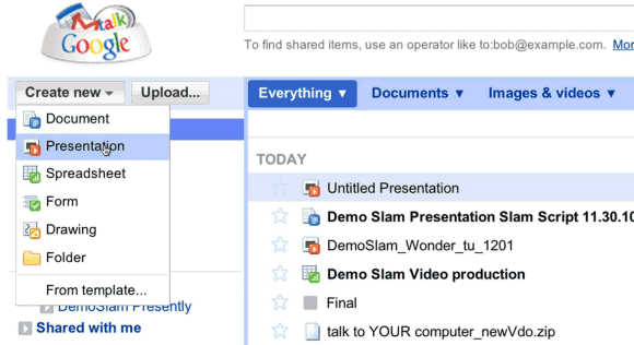
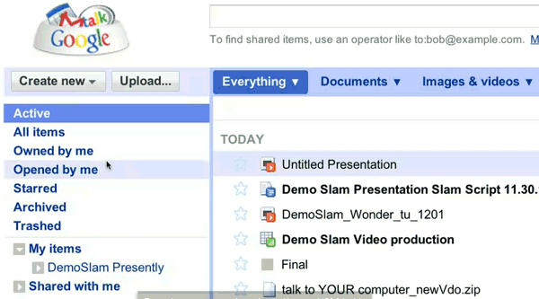
A recent Demo Slam video shows a new Google Docs interface that has separate sections for documents, images & videos and other files, new menu items for active and archived documents, a new navigation bar. Most likely, the new interface is tested internally at Google.


Here's the video:


{ spotted by Andrew }

Friday, December 3, 2010

Why Google Maps Labels Look Better

If you've ever wondered why Google Maps labels look more readable than the labels used by Bing Maps or Yahoo Maps, Justin O'Beirne has some answers.

"The white outlines of Google's city labels are thicker, and you can't see maps' background details (roads, rivers, etc.) behind them. (...) Google typically uses more classes of city labels, at a time, than the other two sites. (...) While the primary difference between each site’s city label classes is their size, Google takes this one step further by also using color to differentiate its city label classes. In that, the smallest city labels on Google’s maps are significantly lighter in color than the largest ones. These lighter labels, in turn, enable smaller cities to fade into background, while allowing the larger cities to stand out."


{ Image licensed as Creative Commons by Justin O'Beirne. }

Thursday, November 18, 2010

Google Search as an Interactive Web App

2010 is the year when Google made the most significant changes to the Google search interface. After many years of improving the underlying search technology without too many obvious changes, Google felt that it has to morph Google search into a modern web application.


Today, Google's search engine has a lot of features that clutter the interface and advanced search features that can't be disabled. The focus has shifted from simplicity to interactivity. Google tries to anticipate your query after typing a few characters, you can filter the results by clicking on an option from the sidebar and you can even preview the results using annotated screenshots.

Until a few years ago, Google tried to find the best search results for your query. Now it helps you find the best query for your search. Google shows search suggestions, automatically corrects typos, ignores words from your query and fetches the list of search results as you type a query. Google search is now a web app that empowers users to adjust the results and to make decisions. It's not a decision search engine, it's just a search engine that lets you decide what are the best results.

Google's results are already personalized using signals like location or search history, but that's no longer enough to sift through billions of search results. The search box can't always capture user intent, so Google had to find ways to extend the search box to the entire search results page.

"As people get more sophisticated at search they are coming to us to solve more complex problems. To stay on top of this, we have spent a lot of time looking at how we can better understand the wide range of information that's on the web and quickly connect people to just the nuggets they need at that moment," explained a Google blog post from 2009 that announced the search options sidebar.

Google is all about reducing the friction of entering a query. You no longer have to "feel lucky" when you type something in the search box because the results are displayed instantly and you can quickly adjust them. Google's results don't have to be perfect because you can customize them until they're perfect for you.

There's one Google doodle that captures the essence of Google's transformation from a simple search engine to an interactive web app. It was used to promote Google Instant, but it's probably the best summary of this post:

Wednesday, October 27, 2010

Google Maps Tests New Navigation UI

Dave P., a reader of this blog, spotted a new UI for the views and layers offered by Google Maps. The new interface enlarges the buttons that let you switch to the satellite view and to the embedded Google Earth, removes the button that lets you switch to the traditional view and adds a layer panel that's only displayed when you mouse over the satellite button.

Another change is that the list of recent searches and Google Maps views is displayed in the layer panel, so you can quickly switch between custom maps, driving directions, local search results and Google Maps layers.


{ Thanks, Dave. }

Sunday, September 5, 2010

Next Week's Google Search Event

Did you know that Google has an Experimental Happiness team? One of the engineers that are part of this team is Othar Hansson, who is a tech lead for rich snippets and a member of Google's Search UI Group.

Did you know that Google has a search czar? His name is Ben Gomes. "I think of Ben as our diplomat," said Marissa Mayer, Google's vice president of search products and user experience. "It's Google; it's search. There's a lot of big personalities; there's a lot of opinions, and Ben is the reasonable one that can help build the bridges. When we look back, there was a point where Larry and Sergey really felt like we needed to name a search czar. And there was only one natural choice -- this was back in 2002 -- and that was Ben." According to Mercury News, "Gomes is responsible for shaping the automatic suggestions users get as they begin typing a query, and the few lines of text and links they get back, which Google calls [snippets]".

Did you know that Google still has more engineers working on search than any other product? Johanna Wright says that "other initiatives, such as Google TV and Android, help move search beyond the desktop and laptop paradigm on to other hardware." Johanna Wright is the "Director of Product Management responsible for Web Search. She oversees the development of Google's search user interface and features and was the initial product lead on Universal Search."

Did you know that Google's first female engineer was Marissa Mayer? She's now Vice President for Search Products and User Experience.

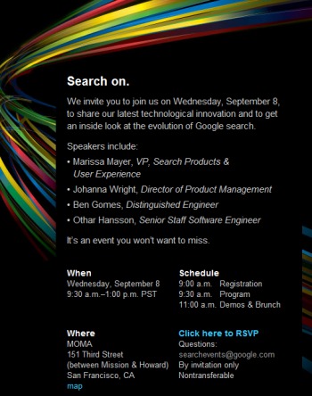
Marissa Mayer, Johanna Wright, Ben Gomes and Othar Hansson will speak next Wednesday at a special event about the evolution of Google search. Most likely, Google will also launch some new features and a new interface.

Google has recently started to test an interface that shows the results as you type the query. The new interface could be launched next week. Shark SEO says that the new UI is especially useful for long-tail searches. "From finding out the best way to deal with MySQL/PHP queries and finding the right Excel formulas, it was just astonishingly, brilliantly useful – it saved me time and led to me finding the right results much faster."

Thursday, September 2, 2010

Google Tests a New Navigation Bar

Google tests a tweaked user interface for the navigation bar. The experiment removes link underlining, changes the background color when you mouse over a link from the navigation bar and adds an icon for the settings menu.


Friday, August 27, 2010

Google Tests Centered Layout

Some users report that Google started to test a centered layout for search results pages. It looks almost like Yahoo Search, except that the navigation bar isn't properly aligned.


The experiment could be related to the "live search" interface that adjusts the results as you type a query. Google's search results could become an extension of the homepage, which already has a centered layout.

{ thanks, Robert and James. }

Friday, August 20, 2010

Google Tests a New Interface for Google Translate

Garrid Lou spotted a new user interface for Google Translate, which shows examples of news sites that can be translated and other Google products that use Google Translate. The new interface replaces the long drop-down of languages with a multi-column list and moves the translated text to the right.


{ via google.org.cn }

Thursday, August 19, 2010

On Gmail's Widget for Selecting Messages

Gmail updated the interface last week and many people complained about the changes. Some didn't like Gmail's new hybrid button for selecting messages. To select unread messages or starred messages, you need an extra click. Apparently, many Google employees hated this change, as well.


Michael Leggett, Gmail's lead user interface designer, explains how he came up with this widget:
It IS odd. And yet, both the checkbox and the menu part tested very well in the lab. The people who hated the widget outside the lab also understood how to use it but promised others wouldn't b/c it was so "weird."

We tried a few things (like putting the select actions under "More actions") but I didn't have high hopes for any of them except the widget that launched. It tested better than I had hoped (all of the participants in the usability study were able to select all, unread, and none). We launched it to all Googlers months ago and listened to feedback (everyone was able to figure it out... some just hated the change).

More about why the change: The "Select all" link is used by <1% style="font-weight:bold;">I wanted to simplify the interface and give back that space to users.

Since features like "select unread" or "select starred" were used by a lot less than 1% of the users, it made sense to hide them. Power users can always learn how to use keyboard shortcuts and an extra click doesn't mean too much for a feature that's rarely used.

Michael Leggett also says that the link to Buzz will be added at the top of the page, next to Contacts and Tasks, and users will be able to hide the links to service they don't use.

{ via Ignore the Code. Thanks, Jérôme Flipo. }