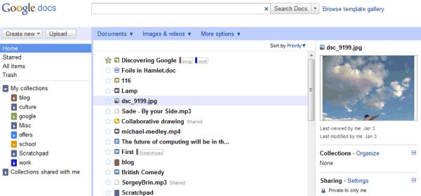
There's a sidebar that shows a small thumbnail and some useful information about the selected file. Google added new filters for images and videos, for public and private files, but dropped the advanced search form, which was more difficult to use. The drawback is that there are many search features that are no longer available in the interface and you need to use operators to get them back.

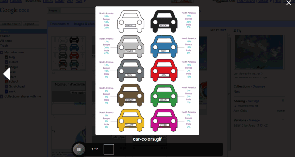
The slideshow feature borrowed from Google Wave is one of the most useful additions:

For some reason, Google Docs has a new name for folders: they're now called collections. "Collections are designed to combine the best features of labels and folders. A file can live in multiple collections, just like with Gmail labels. Collections can also be stored hierarchically, just like folders on your desktop. And of course, collections can be shared, just like you can share docs," explains Google. Technically speaking, none of these features is new, but it's much easier to add a file to multiple
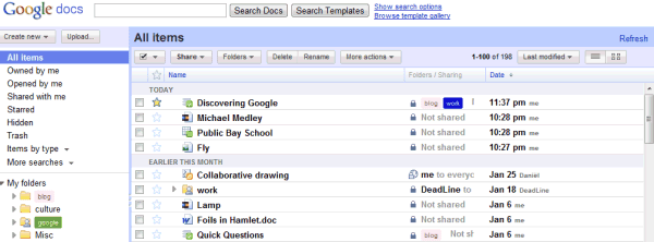
Google also dropped checkboxes, so now it's much more difficult to select multiple files: you need to use Shift for contiguous selections or Control for scattered files (Cmd if you're using a Mac).
Another new feature is priority sorting, which orders files based on importance. For example, a starred document that has been last updated 5 hours ago is likely to rank higher than a more recent document that hasn't been starred. Google says that it's like Gmail's Priority Inbox, but there's an important difference: Gmail always sorts conversations by date.
Overall, the new Google Docs homepage is a mixed bag. Google tries to morph Google Docs into an online storage service, while moving away from the initial goal of the service: editing documents online. Suddenly Google Docs is no longer an appropriate name for the service, 1 GB of free storage is not enough, the APIs are no longer useful because they're limited to editable documents and Google's applications seem limited because they can't handle all the files that can be uploaded. The new homepage can't address these issues, but it manages to make the interface more complicated: now it's a lot easier to open a file when you want to select it and to select the file when you want to open it.
Tip: If you don't like the new interface, there's an option at the top of the page that lets you temporarily switch to the old version. You should bookmark the URL: https://docs.google.com/?ui=1, since there's no option to permanently switch to the old UI.

{ Thanks, Karol and Ben. }
No comments:
Post a Comment